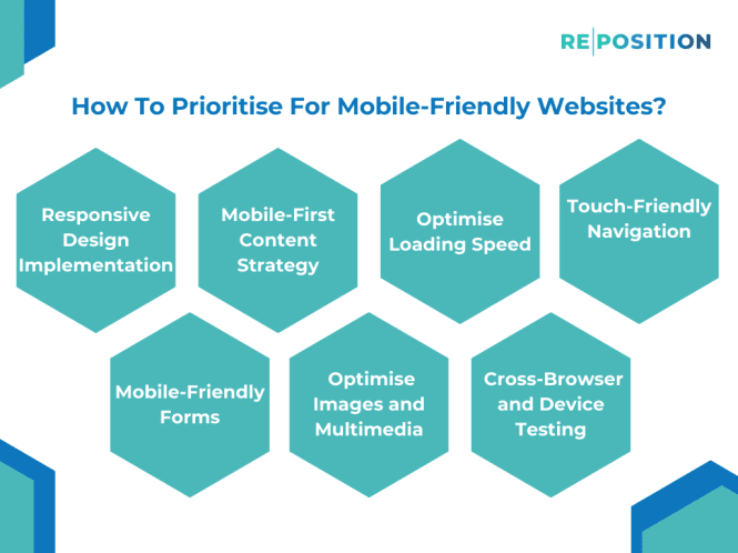
Step 1 – Responsive Design Implementation
Responsive web design implementation should be a priority to ensure your website adapts seamlessly to various screen sizes. Instead of fixed grids based around pixels, use flexible percentage-based grid systems and frameworks which allow elements to resize smoothly across device sizes. Images can also flexibly resize by setting max-widths to 100% and auto height. Furthermore, leverage media queries in your CSS to apply styling rules tailored to desktop, tablet and mobile screens separately. This allows you to tweak designs for each format, for example changing layouts and navigation menus between vertical and horizontal orientations.
When embedding external media like videos, maps or calendars, use responsive embed containers that prevent that content from spilling out of its parent containers on smaller screens. Adopt a mobile-first approach to information architecture and content priority, leading with critical calls-to-action and crucial content before layering in extras for larger screens. Accessible minimalist navigation like a tap-friendly “hamburger” menu works better for touch devices than complex nested desktop menus. Eliminate unnecessary widgets, icons and other elements that simply clutter up precious mobile screen space, simplifying to focus exclusively on facilitating key tasks.
To reveal issues not visible in the desktop context, conduct user testing directly on real mobile devices, both iOS and Android. Zooming, scrolling and tapping around a UI can expose pain points invisible in desktop scenarios. Avoid merely shrinking desktop website layouts down to tiny screens, but instead, build flexibility into components so the design reflows seamlessly across screen sizes following mobile-first and progressive enhancement principles. This ensures an optimal responsive experience relevant to the usage context.
Step 2 – Mobile-First Content Strategy
When designing a content strategy for mobile optimisation, keeping things concise should be a top priority due to the smaller display real estate and short attention spans associated with mobile users. Consider the way people use mobiles on the go for short bursts, completing specific tasks quickly. As compared to desktop users, mobile visitors have less tolerance for long meandering content not relevant to their needs. Your content approach should focus on clear and easy-to-scan information.
Prioritise clear and compelling copy that respects small attention spans. Strictly eliminate any superfluous content, driving towards the end goal of facilitating your user’s task. Use clear structured headings to break up your content into easily digestible sections that are visually distinct even when quickly scanning through. Lists and bullet points can also aid quick mobile perusal where long paragraphs are off-putting.
Aim to use between 50-100 words for each paragraph, keeping sentences short and avoiding large blocks of heavy text. Well-formatted content allows users to quickly decide if a section is worth their attention for the task at hand or to move on just as swiftly, removing unnecessary cognitive load. Remember mobile visitors dip in and out, rarely reading entire articles end-to-end, instead jumping to key nuggets of relevant information. So make your content modular, conveying value in short sections tailor-made for the on-the-go mobile task context.
Step 3 – Optimise Loading Speed
Optimising the loading speed of your mobile website should be a key priority, as quick access to information is imperative in the mobile context. Mobile users are even more sensitive to lag and delay than desktop visitors, with higher expectations for instant gratification. After all, they are often accessing your site on the go to complete specific quick tasks, rather than browsing idly.
There are several techniques to accelerate your mobile page loading, the first being image optimisation. Compress images to the smallest file size possible without losing too much quality. Next, minimise the number of separate server requests required by concatenating CSS and JavaScript files. Leverage browser caching which avoids re-downloading recurring embedded elements like logos each time a page loads. Eliminate unnecessary redirects to external sites which creates delays. Simplify code to reduce processing requirements on mobiles with less computing power than desktops.
Test your mobile site speed using Google PageSpeed Insights and GTmetrix, aiming for load times under 2 seconds. This ensures visitors remain engaged instead of abandoning your site due to the perception of it being slow. The faster your mobile pages load, the higher your search engine rankings become as Google factors speed into listings. More importantly, faster speeds facilitate quicker completion of tasks, driving higher interaction and conversion rates amongst mobile visitors through reduced friction.
Step 4 – Touch-Friendly Navigation
An optimal mobile experience demands touch-friendly navigation suiting the tactile nature of fingertip usage on screens. With less precise control than a mouse cursor, fingers need ample spacing between links and buttons to avoid accidental presses whilst navigating pages. Therefore, design navigation elements are large enough and spaced comfortably apart across the interface.
Generous padding around links gives users visual feedback on where to accurately tap. To adhere to touch target guidelines, ensure interactive elements measure at least 1cm x 1cm physically. This equates to about 48 CSS pixels, allowing plenty of surrounding whitespace. Consistent placement also builds intuition so regular mobile users instinctively know locations to tap without directly looking.
Furthermore, cater interactions to natural gestures fitting real-world behaviours. For example, enable content previews by simply holding a tap on an item as opposed to requiring an additional click. Swiping left/right to cycle through content pieces also aligns with ingrained motions. Analyse the context to determine which tap, hold, swipe and pinch gestures make intuitive sense. Automated user input validation can prevent submissions until fingertip placement meets your prescribed conditions. Overall, deeply understand mobile usage patterns to frictionlessly translate those physical mannerisms into fluid navigational experiences.
Step 5 – Mobile-Friendly Forms
When implementing forms on mobile websites, the user experience should be a top priority to ensure ease of data input. The smaller screen real estate makes entering information more challenging, so simplify the input process as far as possible.
Firstly, limit free text input field lengths to reduce typing requirements. Use dropdown menus, radio buttons and checkboxes so users merely tap selections rather than manually entering text. However, be judicious with long dropdowns which are tricky on mobile – separate categorical options over several shorter lists instead. Input masks can also guide users on required data formats as they start typing.
Additionally, expand tap targets for form buttons and links to at least 48 pixels, giving fingers room to manoeuvre. Position them consistently either right or left aligned so users intuitively know where to input or submit data without hunting around pages.
Streamline forms to necessary fields only, removing any decorative imagery or distracting content around the actual form container. Employ a minimalist approach to declutter interfaces. Optimise keyboards to suit specific data types, such as numerical keypads for phone numbers preventing typos.
Overall, simplify and ease mobile form completion as the final step for users to achieve their goals on your site. Remove obstacles to drive conversions, leveraging format constraints as an opportunity to craft highly focused experiences.
Step 6 – Optimise Images And Multimedia
Optimising images and multimedia for the mobile context is critical given relatively constrained device capacities. With limited bandwidth, slower connections and finite storage space, minimise the file sizes of visually heavy assets without compromising their quality.
For photographs, compress images using online tools to reduce KB sizes. This allows faster loading without degradation in appearance. Ensure correct sizing too – avoid massive hero banners that take ages to load, decimate page speed and waste data allowances. Instead create multiple sizes per image, loading the most optimal one for each viewport and device.
When encoding videos, choose the correct format for cross-compatibility whilst leveraging efficient compression enabling smooth playback even on limited processing power. Slice longer videos into bite-sized chunks to maintain user attention and allow skipping of non-essential sections. For audio, pick small AAC files over higher-bitrate MP3s.
Additionally consider using SVG vector animations in place of heavy GIFs which tend to have massive file weights unsuited for mobiles. Or replace some imagery altogether with lightweight icon fonts that scale responsively retaining crispness on high-resolution displays. Following these multimedia optimisation best practices allows for delivering rich engaging experiences without compromising system performance.
Step 7 – Cross-Browser And Device Testing
Testing mobile sites thoroughly across various devices and browsers is imperative before launch and continuously thereafter. Unlike desktop sites accessed predominantly via Chrome and Firefox, the mobile ecosystem has tremendous fragmentation. Apple Safari, Google Chrome and Microsoft Edge on iOS and Android see significantly differing market shares geographically.
Ensure visually critical CSS renders properly across browser engines, with image containers maintaining proper aspect ratios regardless of iPhone or Android screen dimensions. JavaScript performance profiling may also reveal speed deficiencies particular to certain mobile browsers, allowing targeted optimisations. Eliminate reliance on plugins like Flash or Java that lack universal native support currently.
Additionally test directly on both mobile operating systems, toggling settings like location services or dark mode on and off. Mobile network simulations can mimic 3G/4G connections to benchmark loading times throttled by latency. Validate forms and payments flows across different virtual keyboards which may obscure fields or buttons unexpectedly. Most issues only surface during actual mobile usage testing sessions rather than merely resizing desktop browser windows.
Strive for reliably consistent presentation and behaviour regardless of the mobile browser or device context through an uncompromising testing approach. Building in support ahead rather than retrofitting fixes post-launch futureproofs the responsive design, saving extensive rework later. With mobile usage eclipsing desktop traffic for most websites now, mobile-friendliness cannot remain an afterthought but instead warrants priority status throughout the project lifecycle.
Conclusion
In conclusion, prioritising mobile-friendly websites is essential in today’s digital landscape to cater to the ever-growing number of users accessing the internet via mobile devices. Implementing a responsive design, focusing on a mobile-first content strategy, and optimising loading speed are foundational steps. Incorporating touch-friendly navigation, mobile-friendly forms, and optimising images and multimedia further enhance the user experience on mobile platforms.
Regular cross-browser and device testing are crucial to ensuring consistency and functionality across diverse mobile devices. By prioritising these steps, website owners can not only meet the expectations of mobile users but also contribute to improved accessibility, user satisfaction, and overall success in the competitive online environment.